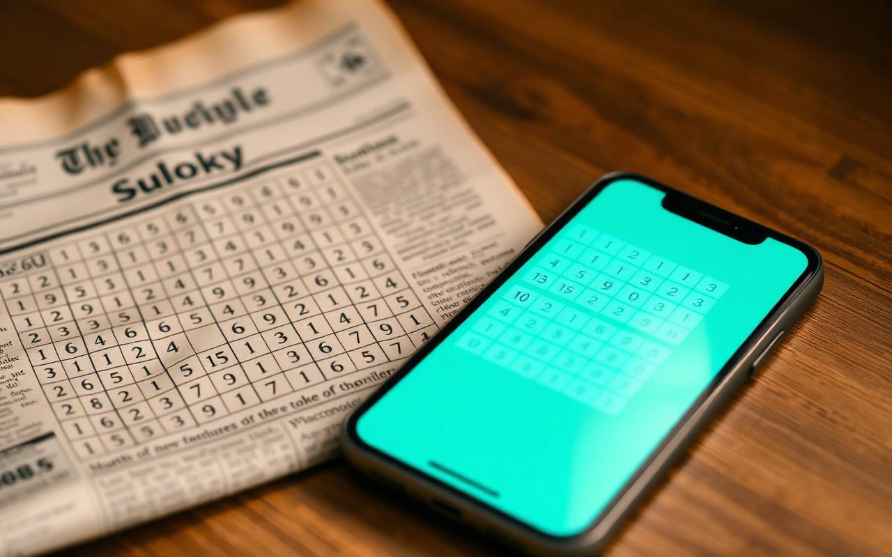
Sudoku is older than most people assume. Its earliest direct ancestor — Number Place — appeared in the American magazine Dell Pencil Puzzles & Word Games in 1979, designed by the retired architect Howard Garns. The puzzle migrated to Japan in 1984, where Maki Kaji of Nikoli refined and popularised it under the name we know today.
From newspaper grids to glass touch surfaces
For two decades Sudoku was a fundamentally analogue experience: printed in low-resolution newsprint, solved with a pencil and an eraser. The first generation of digital Sudoku — appearing on Java feature phones and early Pocket PCs — largely replicated the printed page on a low-resolution screen.
The Material Design turning point
Google's introduction of Material Design in 2014, and its successor Material You in 2021, gave application designers a coherent system for rhythm, hierarchy and motion. For Sudoku, this meant the puzzle could finally inhabit the device rather than imitate the page. Cells could respond softly to touch. Conflicting candidates could be highlighted with deliberate colour rather than crude flashing. Pencil marks could fade in and out with measured easing curves.
What modern Sudoku owes to design discipline
Sudoku: The Clean One is the contemporary embodiment of this shift. Its grid is not decorative; it is structural. Its typography is restrained. Its colour use is informational. The result is a product that respects both the player and the puzzle.
A craft, not a fashion
Design fashions will continue to rotate — skeuomorphism returned briefly, neumorphism flared and faded, glassmorphism is currently in vogue. But the underlying principle remains: a well-designed puzzle interface should disappear, leaving only the logic. The current generation of Sudoku apps demonstrates how far that discipline has matured.
Continue reading
← Back to the Journal